 |
Excel Solutions Team|Computer Training Centers |
| Home | Training Services | Courses & Schedule | Consulting | Room Rentals | Locations | About EST | Contact Us |
713.589.2655
Houston, Texas
210.568.3904
San Antonio, Texas
.
|
||||||||||||||||||||||||||||||||||

|
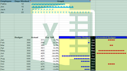
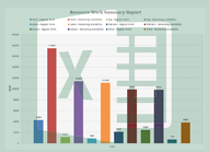
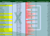
Excel Boot Camp: Create visually appealing charts to analyze data using chart types such as column, bar, line, and pie charts. Additionally, learn to use advanced chart types like the bubble, waterfall, stock, surface, and radar charts. Full Course Description: Are your charts the same boring types that everyone uses, with little true representation of your data? Gain a deeper analysis of your data in this 2 day boot camp when you build charts using the type best suited to your data. Each of the different chart types in Excel 2010 and 2013 are explored, as well as best practices to format the numerous axes or labels so the results are understandable by your audience. Prerequisites: To ensure your success, each student should have a general knowledge of Excel features, navigation, and how to work with contextual tabs in the Ribbon. Feel free to contact us to discuss if this Boot Camp is right for you.
Contact us for more information or to enroll in this boot camp Microsoft Excel 2013 Training Class Outlines:
|
|||||||||||||||||||||||||||||||||||||||||||||||
|
|||||||||||||||||||||||||||||||||||||||||||||||